Timeline
Sept 2024 - June 2025
Responsabilities
Design Project Lead
Company
TEAM23
The design system template tailored for responsive content websites:
TEAM23 delivers websites and content platforms for mid- and large-sized clients across a wide range of industries. Despite similar project types, early project phases repeatedly started from scratch.
Foundational UI components were rebuilt for each project, design and development alignment took time, and patterns varied depending on team setup and time pressure. Documentation quality and accessibility standards were inconsistent, and while components were reused from past projects, there was no structured or scalable reuse process behind it.
This led to higher setup costs, slower project starts, and avoidable inconsistencies across client projects.
The goal was to create a white-label design system template that could be duplicated at the start of each new project and quickly adapted to different client brands. The system needed to support fast theming, include accessibility and documentation by default, and enable a clean design-to-development handoff tailored to TYPO3 website projects.

I followed an iterative, research-driven process, turning insights into practical design system improvements and validating them with designers and developers.
The initial research and system setup started as part of my master’s thesis during my time as a working student at TEAM23. After transitioning into a full-time role, I took full ownership of the design and project coordination. The implementation was carried out in close collaboration with three designers, two developers, and key stakeholders including design, product and company leadership.

Research
I approached the project with a user-centered lens to understand where design systems created friction instead of speed.
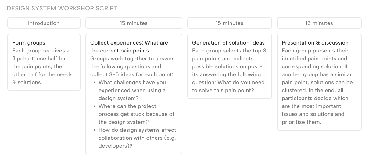
To ground the work in reality, I combined qualitative and practical inputs: a review of industry best practices, analysis of TEAM23’s existing design system work, and close conversations with design and development stakeholders. I also ran a Design Systems workshop with 11 designers and complemented it with an external open survey for designers and developers.
The goal was not to design a “perfect system,” but to understand what blocks adoption in day-to-day work.
Research
The insights were synthesized into an internal working document and clustered around four themes: collaboration, efficiency and creative freedom, accessibility and inclusivity, and long-term sustainability.
While teams valued design systems for alignment and speed, they flagged steep learning curves, unclear onboarding, missing or inconsistent documentation, hard-to-adapt components, gaps in accessibility guidance, and unclear ownership and contribution rules.
These insights directly shaped the system’s direction moving on.

Implementation
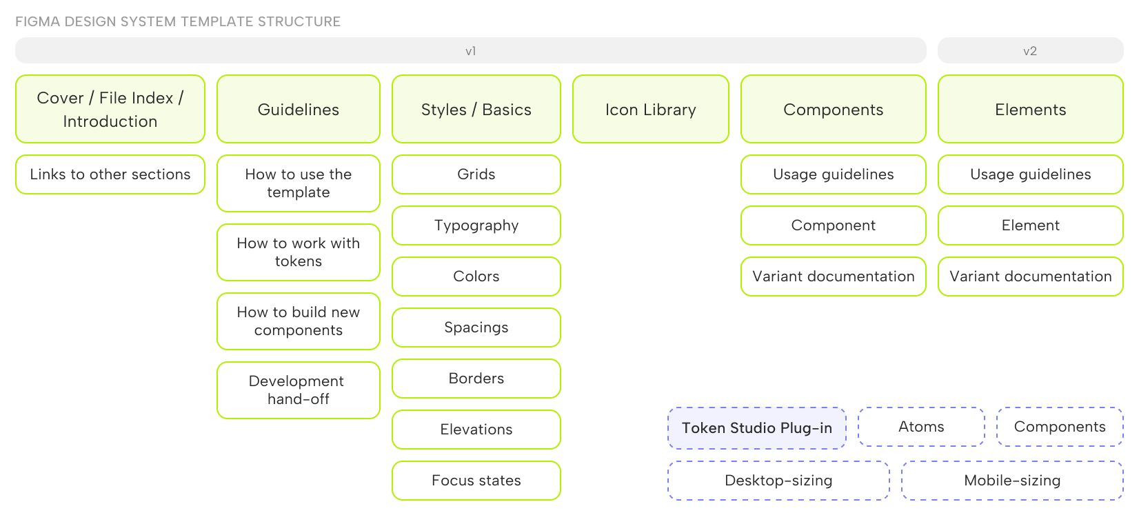
Based on the research and initial audit, I defined the structure of the design system template and set the standard for documentation and handoff. The focus was on creating a clear, reusable baseline that teams could reliably start from, rather than an exhaustive system from day one.
The template includes clear setup and usage guidelines, a structured foundations layer for styles and tokens, and documented components ready for development. A first production-ready version was released, while more complex elements were intentionally scoped for a future V2.
Implementation
To enable fast brand adaptation, I introduced a multi-layer semantic token system using the Token Studio plugin in Figma. Tokens were structured into base atoms, semantic component tokens, and separate desktop and mobile sizing layers to support responsive behavior without duplicating components.
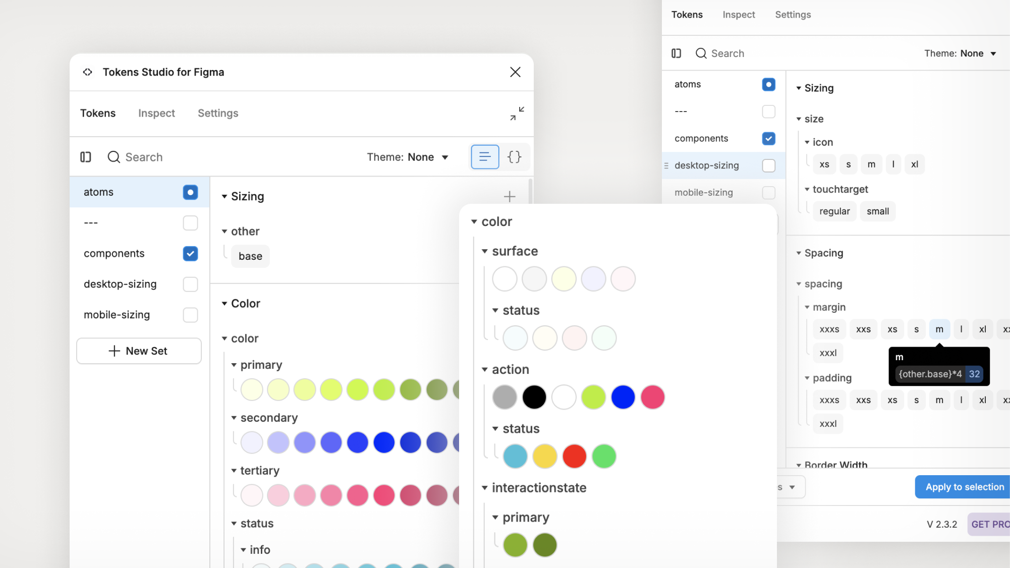
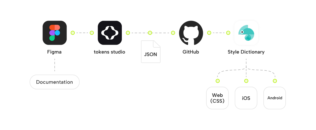
A token pipeline was defined from Figma to Token Studio and JSON, with the goal of syncing tokens into code via GitHub and Style Dictionary. While full automation was out of scope for the first phase, the structure was prepared for future expansion.
Implementation
With the foundation in place, I focused on building clear, adaptable components supported by documentation that works under real project conditions. 20+ components were designed, tested, and refined, starting with high-impact elements such as buttons and inputs.
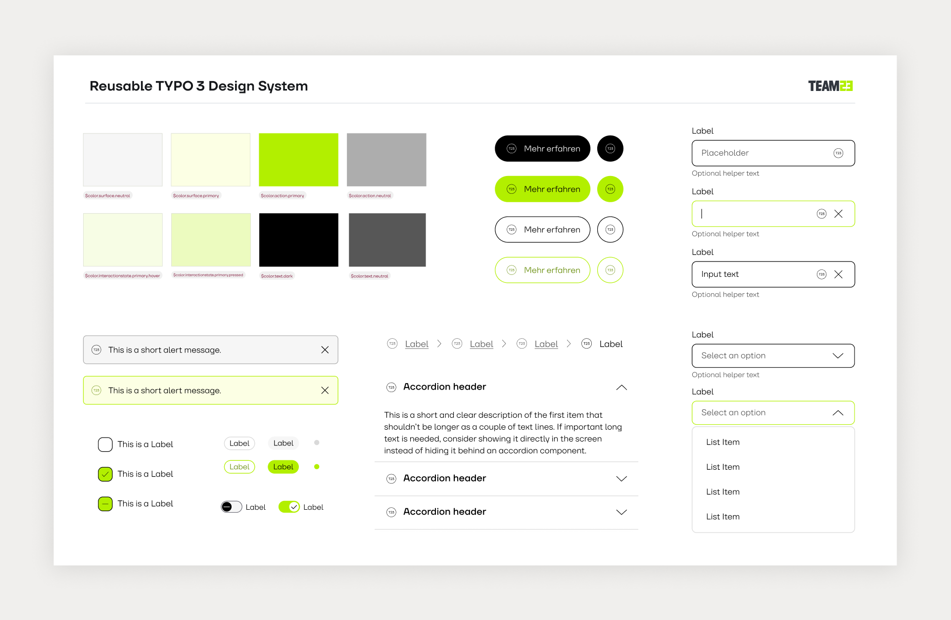
For each component, I created a repeatable documentation format covering usage guidelines, specifications, and token dependencies. Accessibility considerations based on WCAG and internal guidelines were integrated directly into component guidance.


What this enabled
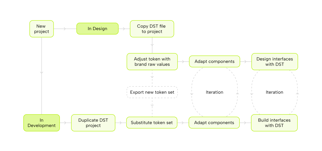
Designers start new projects by duplicating the template and adjusting the token layer. Because all components reference these tokens, the system can be re-skinned quickly across the entire component library without rebuilding UI from scratch.
This enables full brand adaptation in minutes instead of weeks, while preserving structure, behavior, and accessibility.
What this enabled
To support adoption, the template is accompanied by clear, step-by-step documentation guiding teams through their first project setup. This includes instructions on duplicating the template, working with tokens, extending the system, and handing off designs to development.
This significantly reduced onboarding effort and helped teams use the system consistently from the start.

Outcome
The project resulted in a reusable design system template that is now the default starting point for new TYPO3 projects at TEAM23. It provides token-driven theming, a scalable Figma structure, documented MVP components, and a defined token export workflow into development.
Future work includes extending the component library, further automating the design-to-code pipeline, and formalizing governance and contribution rules as adoption grows.
This project reflects my focus on scalable UX foundations, accessibility-by-default, and systems that teams actually adopt.
Along the way, I learned that token-based workflows initially felt too technical for some designers, which highlighted the importance of onboarding and documentation. Balancing flexibility across diverse client needs without overcomplicating components remained a continuous constraint.
If starting this project today, I would leverage AI-assisted development tools (e.g. Cursor) earlier to accelerate the design-to-code connection and reduce dependency on limited developer availability.