Timeline
Oct - Nov 2025
Responsabilities
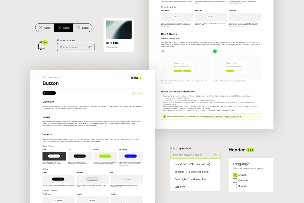
Dashboard architecture, research, interface design
Company
Greenbone AG
I was responsible for the design direction of the project, from early exploration to final interface design. I worked closely with a product owner and a front-end developer to define the information architecture, iterate quickly on design decisions, and establish a scalable foundation for future feature improvements.
To inform the design, I conducted benchmarking of similar security platforms, audited the legacy platform for UX improvements and leveraged existing personas and internal expert knowledge to translate complex requirements into an intuitive dashboard workflow.
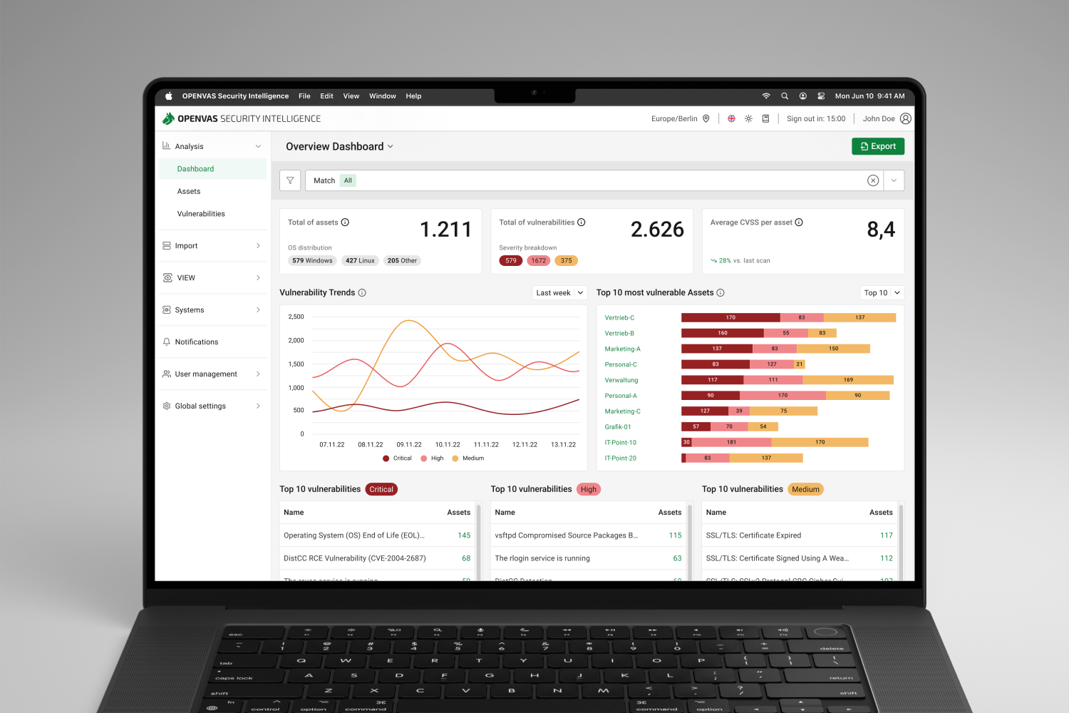
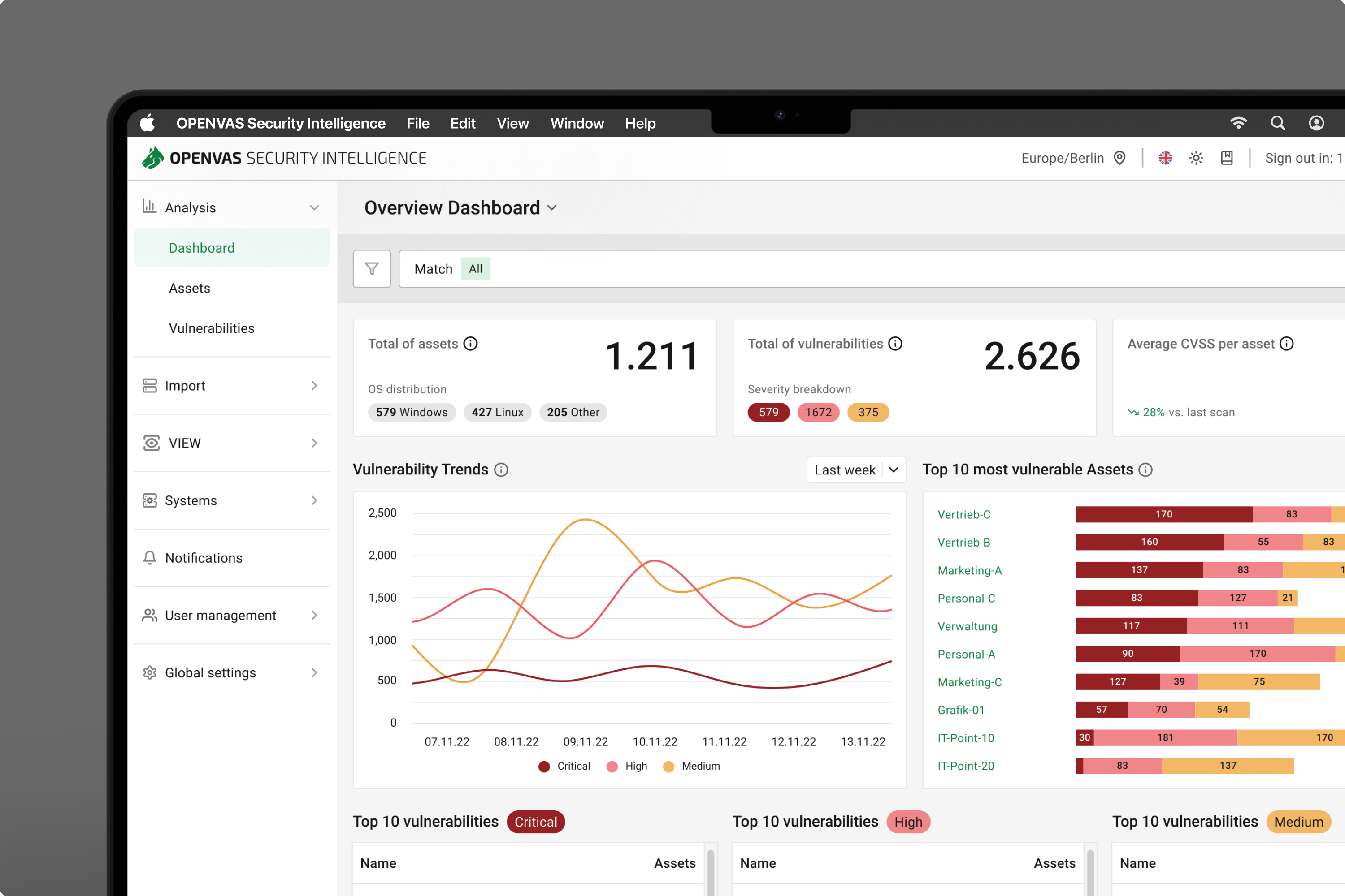
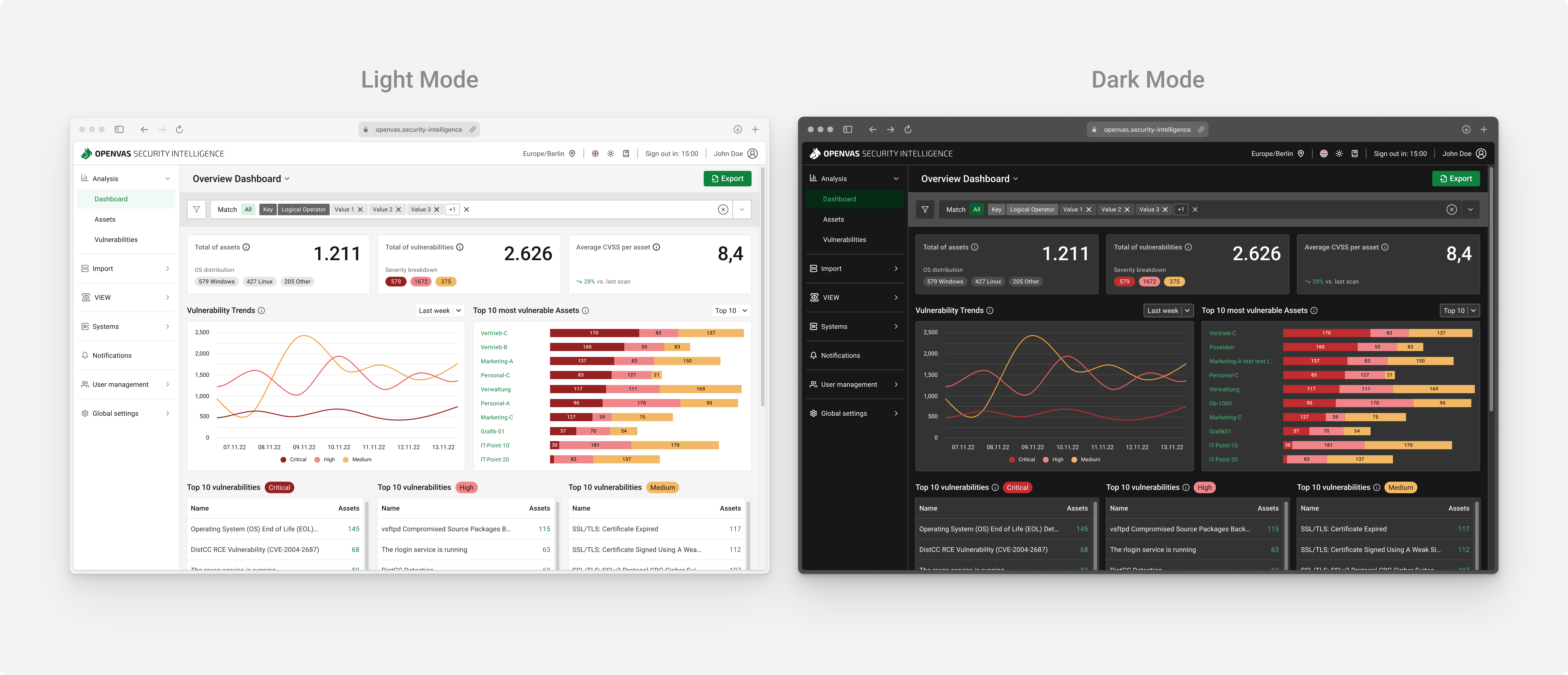
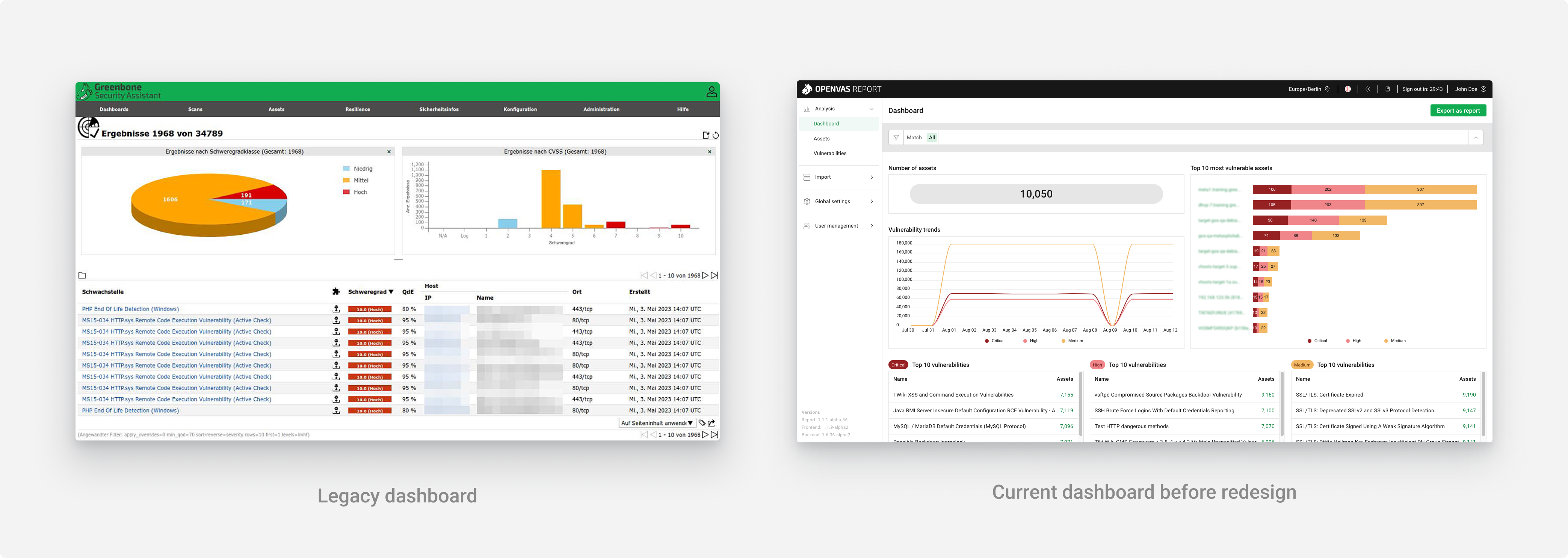
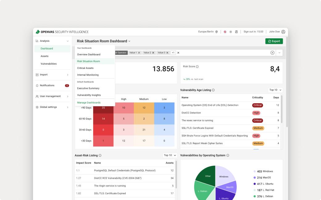
OPENVAS is a family of IT-security products used by organizations to detect and remediate vulnerabilities across complex IT infrastructures. While the dashboard had already been migrated to a new UI framework, its underlying structure was still based on a legacy model.
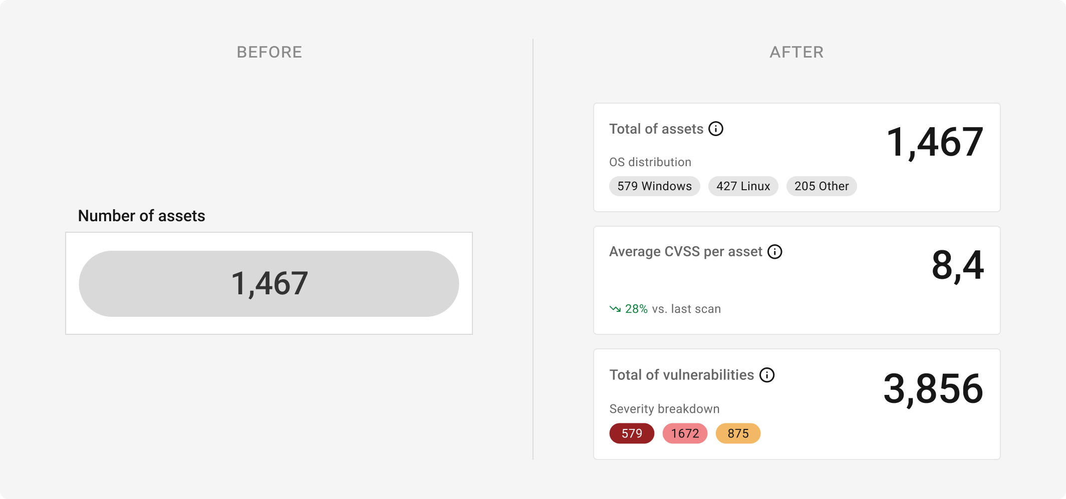
Critical analytic metrics were missing, trend data was fragmented across views, and there was no clear differentiation between user roles. As a result, users struggled to quickly understand their overall security posture and prioritize actions effectively.
The redesigned dashboard delivers value across three key dimensions:
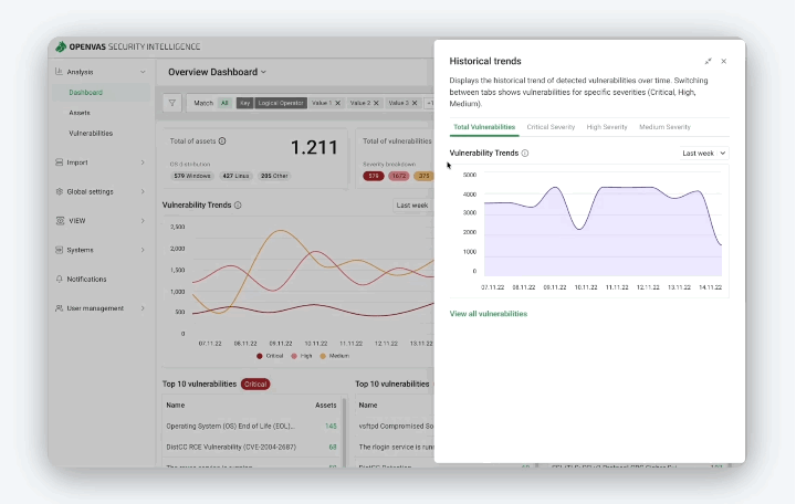
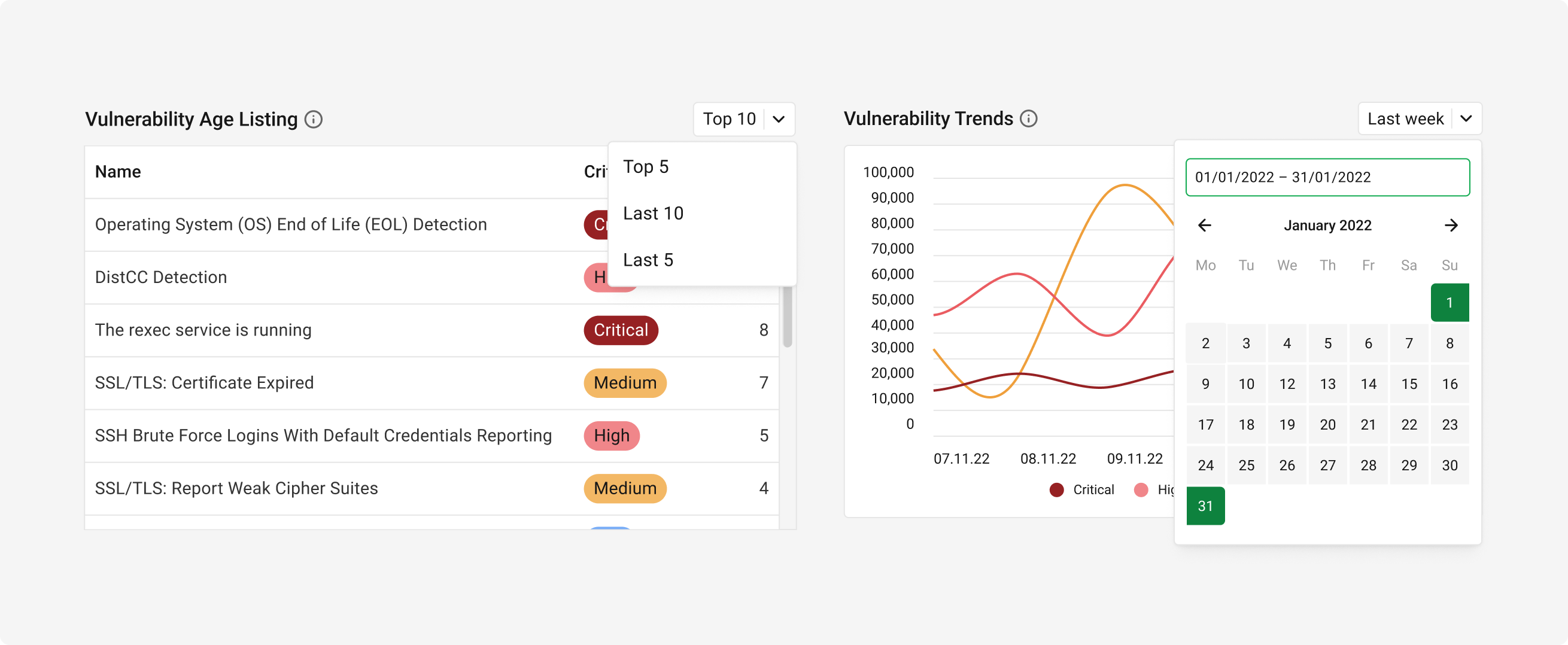
Historical trends and new widget formats with improved visual hierarchy help users quickly understand their security posture. Key metrics, trends, and risk indicators are easier to interpret, reducing cognitive load and supporting faster decisions.
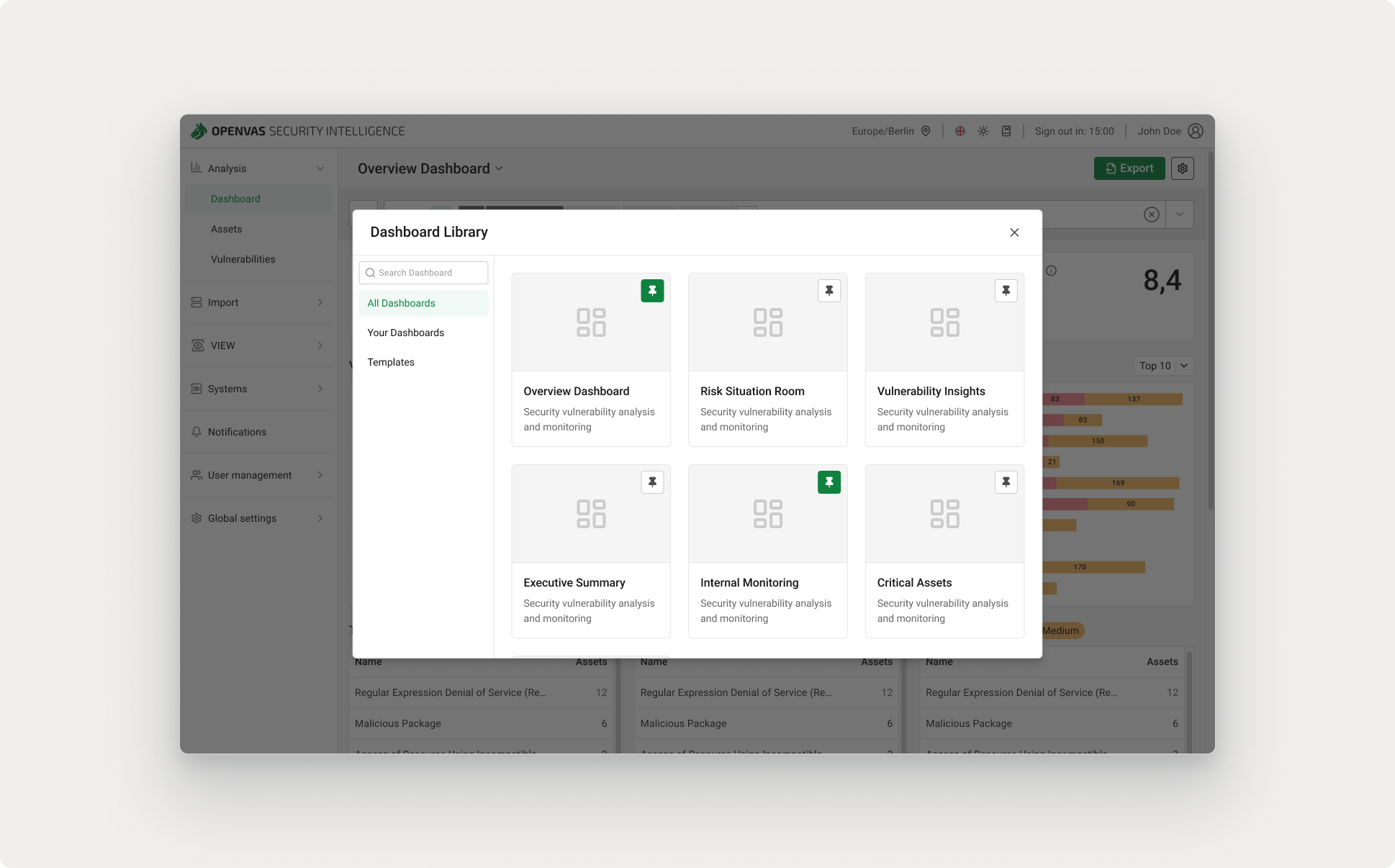
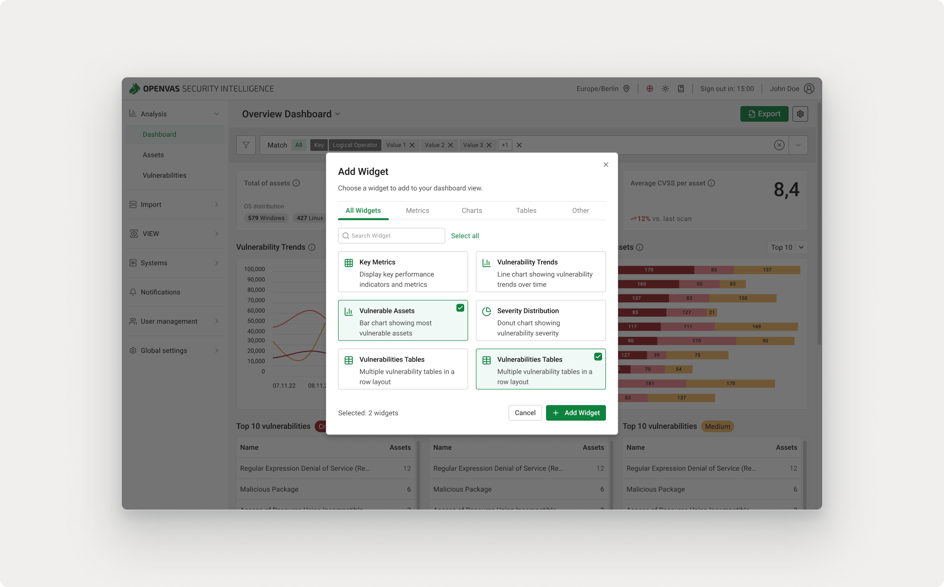
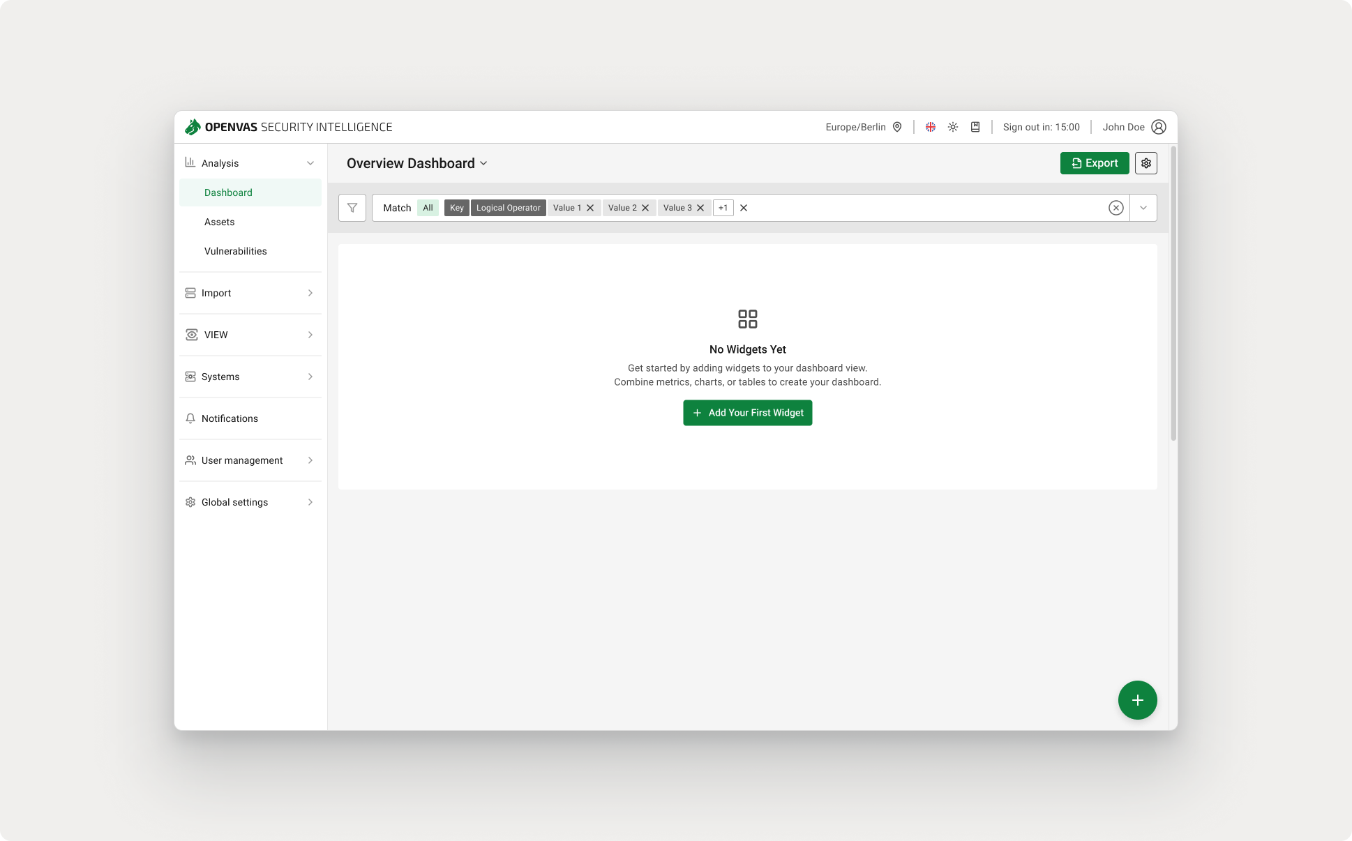
Configurable widgets and different dashboard views allow users to focus on what matters most to their role, from high-level risk overviews for managers to detailed insights for security analysts.
The first release deliberately balanced flexibility with simplicity, creating a solid foundation for future personalization without overcomplicating initial workflows.
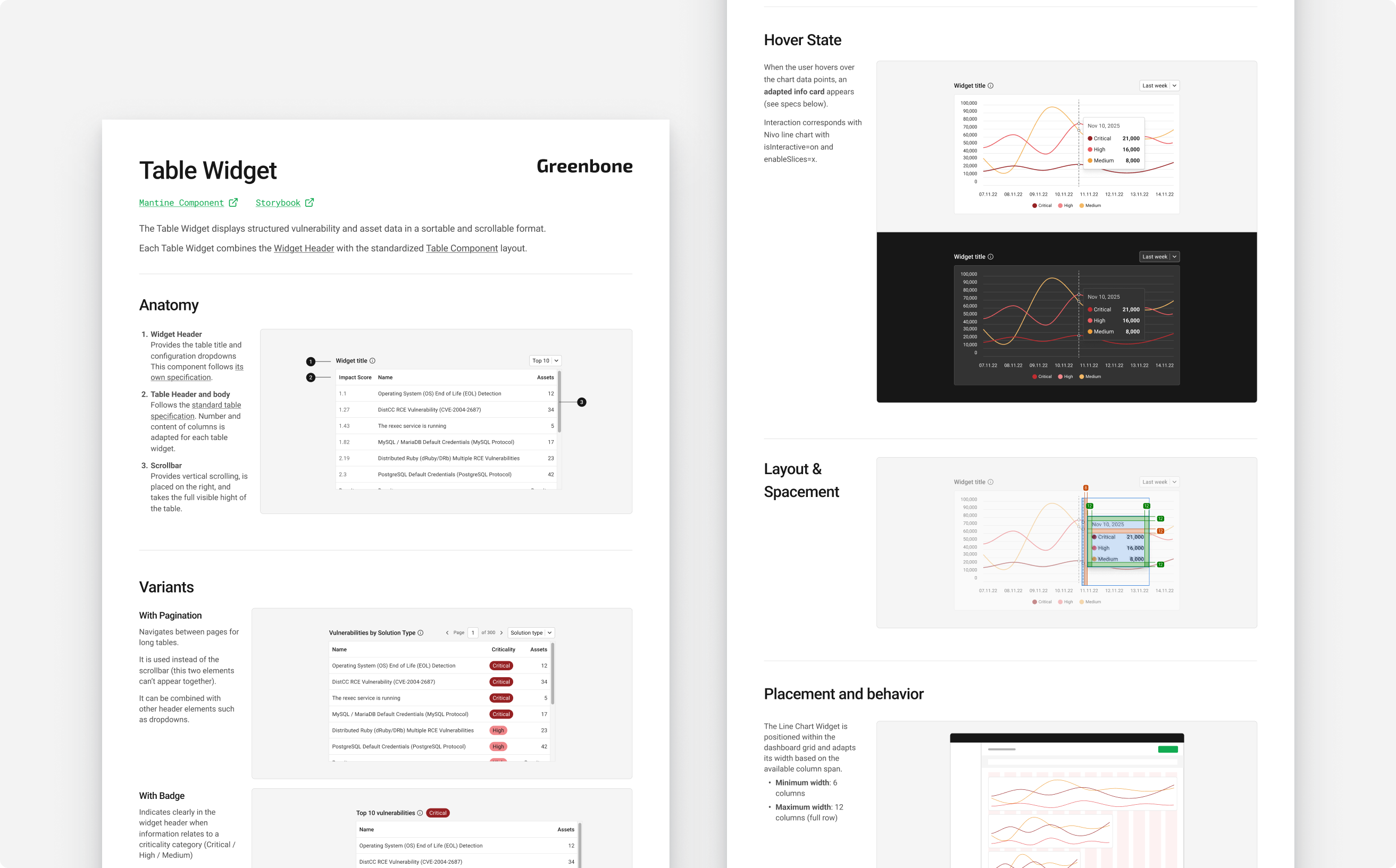
A standardized widget structure reduced inconsistency and prepared the platform for scalable dashboard functionality, including user-generated views in later phases. This approach improved design and development speed and lowered the effort required to introduce new data visualizations.
Clear hand-off documentation and a responsive design ensured that the dashboard is future-proof and easier to maintain as the platform evolves.
This project was also an opportunity to experiment with AI-supported workflows beyond traditional design tools.
Alongside Figma for design and prototyping, I used Figma Make during early exploration to quickly generate alternative layout directions and test structural ideas before refining them manually. During live sessions with the product owner, we used Lovable to iterate on ideas together in real time, testing hypotheses faster than in traditional review cycles.
On the development side, we explored a Cursor–Figma MCP integration test to support the implementation of new dashboard widgets. While still experimental, this approach aimed to reduce translation friction between design and code. This process helped us better understand where AI tools can meaningfully accelerate iteration.
As design began two sprints ahead of development, I explored the evolution of this feature by:
Future steps include expanding personalization options, and continuously validating analytics patterns with real usage data.
This project reinforced the importance of designing for complex, expert-driven products without oversimplifying the domain. Working with limited research resources highlighted the value of leveraging internal knowledge, validating early with experts, and staying closely aligned with development constraints.
OPENVAS is a family of IT-security products used by organizations to detect, analyze, and manage vulnerabilities across complex IT infrastructures. The platform serves highly technical users who rely on accurate, up-to-date security data to make fast and informed decisions. This dashboard redesign took place alongside a major product transition at Greenbone: multiple standalone security tools were being consolidated into a unified security intelligence platform, requiring the user experience to evolve alongside the underlying technical architecture.
The existing OPENVAS dashboard was based on a legacy structure from a previous product generation. While it had already been updated to the new UI framework, it still made it difficult for users to gain a clear overview of their current security posture. Security data was spread across multiple views and formats, increasing cognitive load and slowing down critical workflows. Users struggled to quickly assess risk, prioritize actions, and communicate security status to stakeholders.
The redesigned dashboard delivers value across three key dimensions:
Test
Test